Introduction: Why Color Is the Most Powerful Design Decision You Will Ever Make
Walk into a bright, sunlit room dressed in crisp whites and warm creams, and you immediately feel lighter, more at ease. Step into a bold, midnight-blue study lined with deep walnut shelving, and something shifts — you feel focused, serious, ready to think. Now imagine a dining room bathed in warm terracotta tones with rich amber accents, and suddenly you feel hungry, sociable, and full of warmth.
None of this is accidental. It is color psychology at work.
Color psychology is the study of how colors affect human perception, behavior, mood, and emotion. In the context of interior design and furniture selection, it is one of the most overlooked yet most powerful tools available to homeowners, decorators, and designers alike. The sofa you choose, the dining table you invest in, the bedroom dresser you finally splurge on — every single one of these pieces carries a color that will quietly influence how you feel in that space, every single day.
This article is your definitive guide to color psychology in furniture selection. We will explore what each major color does to a room, how to use that knowledge strategically in every part of your home, and how to combine colors for maximum emotional impact. Whether you are furnishing your first apartment or redesigning your entire home, this knowledge will help you make smarter, more intentional decisions.
What Is Color Psychology and Why Does It Matter in Furniture?
Color psychology is rooted in both science and culture. Research consistently shows that colors trigger specific neurological and emotional responses in the human brain. Warm colors like red and orange activate the sympathetic nervous system — the one responsible for energy and alertness. Cool colors like blue and green activate the parasympathetic nervous system — the one that slows the heart rate and promotes calm.
When it comes to furniture, color plays an even more complex role than it does on walls. A painted wall creates a backdrop. Furniture, on the other hand, occupies space, casts shadows, reflects light, and fills your field of vision in three dimensions. A royal blue velvet sofa does not just add color to a room — it becomes a focal point, a mood anchor, and a statement about how that room is meant to feel.
Understanding color psychology in furniture selection allows you to:
- Control the emotional atmosphere of every room in your home
- Influence the perceived size and scale of a space
- Enhance or reduce natural light depending on your needs
- Create harmony or intentional contrast between design elements
- Support your wellbeing, from better sleep in the bedroom to increased productivity in the home office
Now, let us explore each color in detail — what it means, what it does, and how to use it in your furniture choices.
🔴 Red Furniture: Energy, Passion, and Bold Statement-Making
The Psychology of Red
Red is the most emotionally intense color on the spectrum. It raises heart rate, stimulates appetite, increases energy levels, and commands immediate attention. It is the color of passion, urgency, power, and excitement. Red is virtually impossible to ignore.
What Red Furniture Does to a Room
When you introduce red furniture into a room, you immediately change its energy level. A red sofa in a living room becomes the undeniable focal point — everything else in the room orients itself around it. Red can make large, sparse rooms feel warmer and more intimate, but in small spaces, it can feel overwhelming and even anxiety-inducing if overused.
Red furniture also has an interesting spatial effect: it appears to advance toward the viewer, making it feel larger and closer than it actually is. This can be used to great effect in rooms where you want to create a sense of fullness and vibrancy.
Best Rooms for Red Furniture
Dining rooms are arguably the best place for red furniture. Red stimulates appetite and conversation — it is no coincidence that many of the world’s most popular restaurant brands use red heavily in their branding. Red dining chairs, a bold red sideboard, or a lacquered red console table can transform a dining space into one that truly invites people to sit down, eat, and linger.
Living rooms are another strong candidate. A red accent chair or even a deep red sofa creates a bold, confident focal point that signals a lively, sociable space. In entertainment rooms or home bars, red encourages energy and excitement, making it ideal for spaces designed for socializing and fun.
Design Tips for Red Furniture
Pair red furniture with neutral tones — white, cream, charcoal, or warm grey — to prevent visual overwhelm. Opt for deeper shades of red like burgundy, wine, or oxblood for a more sophisticated, mature feel. Bright cherry reds are more playful and casual, while earthy brick reds evoke warmth and rusticity. Avoid placing red furniture in bedrooms or home offices, where you need calm and focus rather than stimulation.
🔵 Blue Furniture: Calm, Trust, and Timeless Sophistication
The Psychology of Blue
Blue is the world’s most universally loved color. It is associated with calm, trust, reliability, depth, and intelligence. Studies show that blue environments can lower blood pressure, reduce anxiety, and encourage clear thinking. It is the color of the sky and the ocean — spaces that humans instinctively associate with openness and freedom.
What Blue Furniture Does to a Room
Blue furniture has a receding visual effect — it appears to push back from the viewer, making rooms feel more spacious and open. Light, airy blues like powder blue and sky blue create a fresh, breezy atmosphere, while deeper shades like navy, cobalt, and indigo introduce drama, depth, and a sense of quiet authority.
Blue is also highly versatile. It can feel contemporary and sleek in a modern setting, or warm and coastal when combined with natural textures like linen and rattan. Because blue so rarely appears in organic, natural materials, blue furniture commands attention without being aggressive — a rare and valuable quality in design.
Best Rooms for Blue Furniture
Bedrooms are perhaps the single best application for blue furniture. Blue promotes relaxation and restful sleep. A navy upholstered bed frame, a soft teal accent chair in the corner, or a set of deep blue bedside tables can transform a bedroom into a genuine sanctuary. The brain associates blue with the sky at dusk — a natural cue to wind down and rest.
Home offices benefit enormously from blue furniture. Blue supports concentration, calm, and clear thinking. A blue desk, a cobalt bookshelf, or even a navy office chair creates an environment that keeps the mind focused and alert without being overstimulating.
Living rooms dressed in navy or royal blue sofas are bold yet balanced, lending sophistication and visual depth that feels timeless rather than trendy. A navy velvet sofa, in particular, has become one of the most iconic pieces in contemporary interior design.
Design Tips for Blue Furniture
Pair navy and cobalt blue with brass, gold, or copper hardware and accents for a luxurious, high-end look. Light blues pair beautifully with white, natural wood, and soft greens. Avoid combining too many cool tones in a single room without adding warmth — an all-cool space can begin to feel clinical or cold. A warm wood floor or an amber throw pillow can balance out a predominantly blue scheme effortlessly.
🟢 Green Furniture: Balance, Nature, and Restorative Energy
The Psychology of Green
Green sits at the very center of the visible color spectrum, making it the most naturally balanced color available to us. It is the color most associated with nature, health, renewal, and growth. Research in environmental psychology consistently shows that green environments — and even green interiors — reduce stress, improve mood, and restore depleted mental energy. It is no coincidence that waiting rooms, hospitals, and schools have historically used green in their interiors.
What Green Furniture Does to a Room
Green furniture introduces a sense of life, freshness, and grounded calm into any room. Lighter greens like sage, mint, and pistachio create an airy, refreshing quality that feels both modern and timeless. Deeper shades like forest green, olive, and emerald add richness, drama, and a touch of quiet luxury that has made them enormously popular in high-end interior design circles.
Because green is so strongly associated with the natural world, it also makes rooms feel more organic, comfortable, and connected to the outside — even in city apartments with no access to a garden. Green furniture essentially brings the outdoors inside, creating what designers call a biophilic effect.
Green has a particularly neutral visual weight — it neither advances nor recedes dramatically, giving it remarkable flexibility in design. It works harmoniously with both warm and cool tones, making it one of the most forgiving colors to work with.
Best Rooms for Green Furniture
Living rooms are transformed by a sage or forest green sofa. The result is a calming, welcoming atmosphere that feels simultaneously sophisticated and relaxed — perfect for both entertaining guests and quiet evenings at home.
Kitchens benefit greatly from green cabinetry and furniture accents, which introduce freshness and a natural connection to food, health, and organic living. Sage green kitchen islands and dining chairs have become a defining trend of contemporary kitchen design.
Bedrooms dressed in softer greens promote rest, calm, and a sense of being cocooned in nature. Darker greens like forest green feel cozy and enveloping — ideal for creating the deeply restful atmosphere that the best bedrooms require.
Design Tips for Green Furniture
Green pairs exceptionally well with warm natural materials — wood, rattan, terracotta, linen, and leather. Darker greens look stunning against white walls and light floors. Earthy greens like olive and khaki work brilliantly in rustic or farmhouse settings, while jewel-toned emeralds feel right at home in maximalist or Art Deco-inspired spaces. Avoid overusing green alongside too many other saturated colors — its power lies in its ability to anchor and ground a space.
🟡 Yellow Furniture: Optimism, Warmth, and Creative Energy
The Psychology of Yellow
Yellow is the color of sunshine, optimism, and mental stimulation. It is associated with happiness, creativity, energy, and intellectual engagement. In its brightest, most intense forms, yellow can trigger anxiety and visual fatigue. But in softer, more muted tones — mustard, ochre, buttercream, and golden amber — it creates an uplifting, inviting warmth that few other colors can match.
What Yellow Furniture Does to a Room
Yellow furniture is one of the most effective ways to bring warmth and light into a room — especially in north-facing or dimly lit spaces where natural light is limited. A mustard yellow armchair, for example, can transform a cool, grey room into a cozy, inviting retreat. Yellow catches and reflects light brilliantly, making rooms feel brighter and more energetic without any structural changes whatsoever.
Bright yellows are playful and creative, making them excellent for children’s spaces and creative studios. Muted yellows and mustards feel sophisticated and grounded, sitting comfortably alongside earthy, autumnal color schemes that have dominated interior design trends in recent years.
Best Rooms for Yellow Furniture
Living rooms benefit from a well-placed mustard armchair or ochre accent table, which adds warmth, personality, and a compelling focal point without overwhelming the space. Yellow accents in a living room feel cheerful and welcoming — qualities that make guests feel immediately at ease.
Kitchens and dining areas are excellent candidates for yellow furniture. Like orange, yellow stimulates appetite and conversation, making it ideal for shared eating spaces. Yellow dining chairs around a wooden table are a particularly well-loved combination in modern farmhouse and Scandinavian interior styles.
Children’s rooms thrive with bright, cheerful yellows that encourage creativity, energy, and joyful play. Combined with primary blues and reds, yellow creates a vibrant, stimulating environment that supports child development.
Design Tips for Yellow Furniture
Avoid using bright yellow on large upholstered pieces like sofas — its intensity can quickly feel overwhelming in large doses. Instead, use it strategically on accent chairs, side tables, cushions, ottomans, and lamps. Pair mustard yellow with charcoal, navy, or deep brown for a warm, sophisticated look. Combine soft yellows with white and natural wood for a fresh, airy, Scandinavian-inspired feel.
🟠 Orange Furniture: Warmth, Creativity, and Unstoppable Social Energy
The Psychology of Orange
Orange is the most social color in the entire spectrum. It combines the energy of red with the warmth of yellow, producing a color that is outgoing, creative, enthusiastic, and deeply warm. Orange is associated with adventure, confidence, comfort, and conviviality — it is, quite literally, the color of a warm, flickering flame.
What Orange Furniture Does to a Room
Orange furniture brings extraordinary warmth and energy to a room. Terracotta and burnt orange tones have become some of the most beloved furniture colors of the past several years, precisely because they feel simultaneously modern and ancient — rooted in earthy, natural warmth while remaining fresh and contemporary.
Like red, orange has a visually advancing quality and can make rooms feel warmer and cozier. In large, cold, or dimly lit rooms, this is a significant asset. In small, already warm spaces, use orange with measured restraint to avoid the space feeling claustrophobic.
Best Rooms for Orange Furniture
Living rooms anchored by a terracotta sofa or a burnt orange accent chair radiate incredible warmth and grounded personality. Orange living rooms feel inviting, confident, and deeply human — free of the sterile, overly polished quality that can make some modern interiors feel cold and unwelcoming.
Dining rooms benefit from orange’s ability to stimulate both appetite and sociability. It is no accident that many of the warmest, most inviting dinner parties happen in rooms with terracotta and amber tones. Orange dining chairs or a burnt orange upholstered bench can completely transform the energy of a dining space.
Design Tips for Orange Furniture
Pair terracotta and burnt orange with natural rattan, warm wood tones, cream, and olive green for a beautifully organic, earthy scheme. Brighter oranges work brilliantly alongside teal, navy, or cobalt blue — one of the most dynamic complementary color pairings in design. Avoid pairing orange with pink or purple unless you are deliberately pursuing a bold, maximalist palette.
⚪ White and Cream Furniture: Purity, Space, and Understated Elegance
The Psychology of White
White is associated with purity, cleanliness, simplicity, and light. It creates a sense of openness, clarity, and calm. In interior design, it is the color of fresh starts, deliberate minimalism, and refined elegance.
What White and Cream Furniture Does to a Room
White and cream furniture has one superpower above all others: it creates the perception of space. White furniture visually recedes, making rooms appear larger, lighter, and more open than they actually are. This makes it particularly valuable in small apartments, compact bedrooms, and narrow hallways where the goal is to maximize the sense of space without structural changes.
Cream and off-white tones add warmth that pure white sometimes lacks, making them particularly well-suited to living spaces and bedrooms where a cold, clinical atmosphere would be unwelcoming. White furniture also acts as a perfect canvas — it allows other design elements like colorful cushions, patterned rugs, and bold artwork to take center stage without competing for attention.
Best Rooms for White and Cream Furniture
White furniture works brilliantly in virtually every room of the home. In living rooms, white sofas and armchairs create a fresh, airy base that allows other colors to shine. In bedrooms, white bed frames and dressers reinforce the sense of cleanliness and calm that promotes restful sleep. In kitchens and dining rooms, white furniture creates a bright, clean aesthetic that feels both modern and timeless.
Design Tips for White Furniture
Balance white furniture with warm textures — linen, wool, jute, and natural wood — to prevent the space from feeling sterile. Layer different shades of white and cream for a tone-on-tone effect that adds depth without introducing color. Be mindful of maintenance: white upholstered furniture in high-traffic family homes requires either protective fabric treatments or realistic expectations about regular cleaning.
⚫ Black and Charcoal Furniture: Drama, Depth, and Sophisticated Authority
The Psychology of Black
Black is the color of authority, elegance, sophistication, and mystery. In furniture, it is one of the most powerful choices available — capable of transforming an ordinary room into a space of real drama and visual impact. Black does not so much add color to a room as it adds weight, definition, and presence.
What Black Furniture Does to a Room
Black furniture creates a striking contrast in light, bright rooms. A black dining table against white walls, a charcoal grey sofa in a cream-toned living room, or a matte black shelving unit in a natural wood study — all of these combinations produce a visual tension that is deeply satisfying to the eye. Black grounds a space, providing an anchor that stops bright, airy rooms from feeling too insubstantial or light.
Charcoal and dark grey are the more forgiving cousins of pure black — they carry the same visual weight and sophistication but feel slightly softer and more livable, especially in larger upholstered pieces like sofas and sectionals.
Best Rooms for Black Furniture
Dining rooms are one of the very best settings for black furniture. A black dining table conveys formality, elegance, and occasion — it signals that meals in this room are events worth dressing up for. Paired with upholstered dining chairs in a contrasting color, a black table becomes a truly stunning centerpiece.
Home offices and studies are dramatically improved by dark, commanding furniture. A black desk and bookshelf create an environment of focus, authority, and intellectual seriousness. Bedrooms with black bed frames feel luxurious, dramatic, and deeply intimate — particularly effective when paired with rich jewel tones and layered textiles.
Design Tips for Black Furniture
Balance black furniture with plenty of light — natural light through large windows, warm artificial lighting, and light-colored walls and floors. Pair black with warm tones like gold, brass, caramel, and terracotta to prevent a cold, austere atmosphere. Avoid using too many large black pieces in small rooms, as the visual weight can become oppressive.
🟤 Brown and Wood-Tone Furniture: Stability, Warmth, and Natural Comfort
The Psychology of Brown
Brown is the color of the earth, of wood, of soil, and of stone. It is inherently grounding, stable, warm, and reassuring. Brown communicates reliability, naturalness, comfort, and permanence. It is perhaps the single most universally comfortable color in interior design — the one that almost everybody responds to positively, regardless of their personal aesthetic preferences.
What Brown Furniture Does to a Room
Brown furniture — whether expressed through natural wood tones, leather upholstery, or woven rattan — creates a sense of organic warmth that is almost impossible to replicate with synthetic or painted alternatives. Wood-tone furniture connects a space to the natural world, creating environments that feel genuinely lived-in, comfortable, and real.
Brown furniture has a grounding visual effect. In rooms that feel too stark, too cold, or too clinical, the introduction of natural wood furniture immediately makes the space feel more human and habitable. It is no coincidence that the most enduringly popular furniture in history — from ancient carved chairs to contemporary oak dining tables — has been made from natural wood.
Best Rooms for Brown and Wood-Tone Furniture
Brown furniture works in every single room of the home without exception. It is perhaps most transformative in living rooms, where a warm walnut coffee table or a leather sofa creates an instant sense of coziness and permanence. In dining rooms, a solid wood dining table is one of the most powerful pieces you can own — it becomes the natural gathering point for the family, a place where life happens.
Design Tips for Brown Furniture
Mix different wood tones thoughtfully — very different tones (very light and very dark) can clash, while tones that are close but not identical create a pleasingly layered effect. Pair brown wood furniture with natural textiles, plants, and warm lighting to reinforce the organic, nature-connected atmosphere that brown furniture naturally creates.
🟣 Purple Furniture: Luxury, Creativity, and Royal Confidence
The Psychology of Purple
Purple has historically been associated with royalty, luxury, wisdom, and spiritual depth. It combines the calm stability of blue with the energetic stimulation of red, resulting in a color that feels simultaneously restful and stimulating — deeply creative and thoughtful.
What Purple Furniture Does to a Room
Purple furniture makes a room feel lavish, distinctive, and creatively charged. Deep purples like plum, aubergine, and violet create an atmosphere of rich, intimate luxury. Lighter purples like lavender and lilac create a softer, more dreamy and romantic atmosphere.
Purple is one of the rarest furniture colors, which means that using it well makes a room feel genuinely unique and personally expressive. It is not a color for those seeking safe, predictable interiors — it is for those who want their home to feel like a personal statement.
Best Rooms for Purple Furniture
Bedrooms are the most natural home for purple furniture. Lavender and soft lilac tones are calming and romantic, while deeper plums create an atmosphere of sensuous luxury. A plum velvet headboard or an aubergine armchair in the bedroom corner can transform an ordinary room into something truly special.
Creative studios, reading rooms, and meditation spaces benefit from purple’s unique ability to stimulate both the imagination and a sense of contemplative calm. It encourages introspection, creativity, and deep thinking.
Design Tips for Purple Furniture
Pair deep purples with gold, brass, or silver accents for a genuinely luxurious effect. Softer lavenders work beautifully alongside soft grey, white, and natural wood. Avoid combining purple with orange or bright red — these clashing warm tones can make the space feel chaotic and visually exhausting.
How to Combine Colors in Furniture: The Essential Rules
Understanding individual colors is only half the equation. The real skill in color psychology lies in how you combine colors across different furniture pieces and throughout different rooms. Here are the fundamental principles to guide you.
The 60-30-10 Rule is the most widely used formula in interior design. Sixty percent of the room should be your dominant color (usually walls, floors, and large furniture), thirty percent your secondary color (medium-sized furniture, curtains, and rugs), and ten percent your accent color (cushions, throws, decorative objects, and small statement pieces). This ratio creates natural visual harmony without monotony.
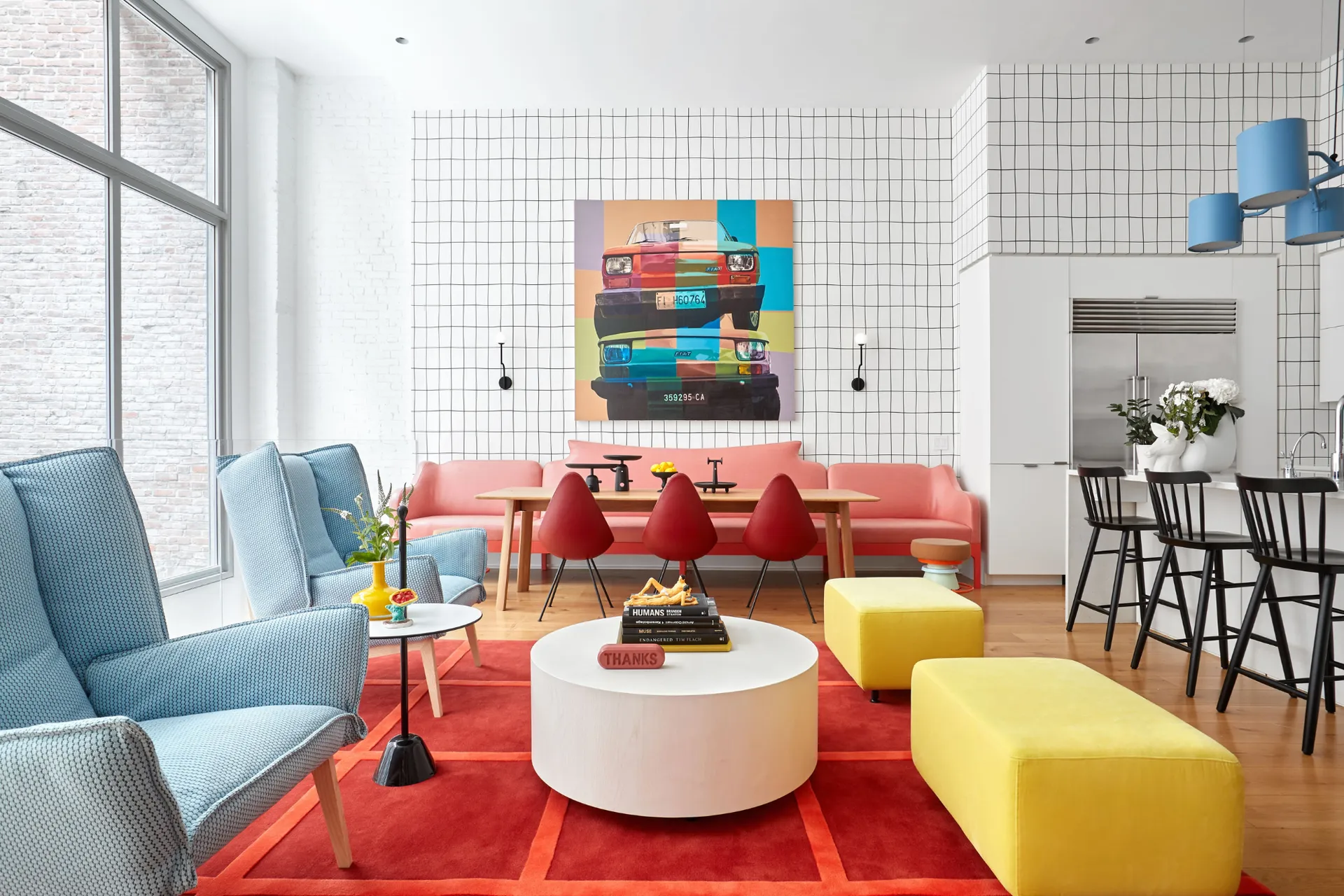
Complementary colors — colors directly opposite each other on the color wheel, such as blue and orange, or green and red — create the most vibrant, energetic contrast. Use complementary pairings when you want a room to feel bold, dynamic, and visually exciting.
Analogous colors — colors that sit next to each other on the color wheel, such as blue, teal, and green — create harmonious, cohesive schemes that feel calm, unified, and naturally balanced. These are excellent choices for bedrooms, bathrooms, and other spaces where serenity is the primary goal.
Neutral anchoring is perhaps the most important concept for furniture selection, specifically. No matter how bold or colorful your statement furniture pieces are, grounding them in a neutral foundation — cream walls, warm grey floors, natural wood accents — prevents visual chaos and ensures that your colorful pieces can breathe and be appreciated on their own terms.
Room-by-Room Color Psychology Guide for Furniture
Living Room: Choose furniture colors that reflect how you use the space. If your living room is primarily for entertaining and socializing, warm colors like terracotta, burnt orange, mustard, and rich red create the energetic, welcoming atmosphere you need. If it is primarily a relaxation space, cooler tones like sage green, navy, and soft grey create a calming retreat.
Bedroom: The bedroom is your sanctuary. Prioritize colors that promote calm, rest, and intimacy. Blues, greens, lavenders, and deep, cocooning neutrals are the strongest choices. Avoid highly stimulating colors like bright red and orange in this space.
Dining Room: Prioritize appetite-stimulating and conversation-encouraging colors. Reds, oranges, warm yellows, and terracottas are the classic choices for good reason. A bold furniture color in the dining room signals that meals here are occasions — experiences to be savored and remembered.
Home Office: Prioritize focus, calm, and mental clarity. Blue is the gold standard for productivity-enhancing furniture. Green is an excellent alternative, and charcoal or dark grey conveys the kind of professional authority that keeps you in work mode.
Children’s Room: Bright, primary colors encourage creativity, energy, and play. As children grow older, allow them to express their color preferences — personal choice in bedroom decor is a powerful tool for developing a child’s sense of identity and ownership.
Conclusion: Color Is an Investment in Your Well-being
Color psychology in furniture selection is not about following rigid rules — it is about understanding the deep, powerful connection between color and human emotion, and using that understanding to create spaces that genuinely serve the people who live in them.
Every piece of furniture you bring into your home carries a color, and every color carries a feeling. A navy sofa is not just a navy sofa. It is a daily invitation to slow down, think clearly, and rest deeply. A terracotta armchair is not just a piece of upholstered furniture. It is a warm embrace at the end of a long day.
When you select furniture with color psychology in mind, you stop decorating and start designing — with intention, with knowledge, and with a clear vision of the life you want your home to support. The result is not just a beautiful room. It is a space that works for you, speaks to you, and makes you feel exactly the way you want to feel every time you walk through the door.
That is the true power of color. And it starts with the furniture you choose.