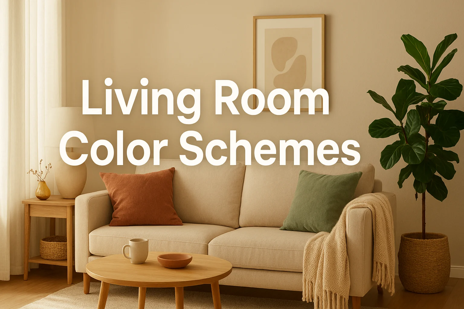
Choosing the right color scheme for your living room can transform it from a simple space into a stunning sanctuary that reflects your personality and enhances your daily life. With endless possibilities available, finding the perfect palette can feel overwhelming. This comprehensive guide explores over 50 proven color combinations that work beautifully in living rooms, helping you create a space that’s both stylish and functional.
Understanding Color Psychology in Living Rooms
Before diving into specific palettes, it’s essential to understand how colors affect our mood and perception of space. Your living room is often the heart of your home—a place for relaxation, entertainment, and connection. The colors you choose will significantly impact how you and your guests feel in this space.
Warm colors like reds, oranges, and yellows create energy and intimacy, making large rooms feel cozier. Cool colors such as blues, greens, and purples promote calmness and can make small spaces feel more expansive. Neutral tones provide versatility and timelessness, serving as perfect backdrops for bolder accents.
The 60-30-10 Rule: Your Color Distribution Guide
Professional designers often follow the 60-30-10 rule when creating balanced color schemes. This principle suggests using your dominant color for 60% of the room (usually walls), a secondary color for 30% (upholstery, curtains, large furniture), and an accent color for the remaining 10% (decorative accessories, pillows, artwork).
This formula creates visual harmony while preventing any single color from overwhelming the space. As you explore the palettes below, consider how you might apply this rule to your own living room.
Timeless Neutral Palettes
1. Classic Cream and Beige
Combining various shades of cream, beige, and taupe creates a sophisticated, hotel-like atmosphere. This palette works exceptionally well in rooms with abundant natural light and can be layered with different textures like linen, velvet, and natural wood to add depth without introducing bold colors.
2. Greige (Gray-Beige) Harmony
Greige has dominated interior design for good reason—it offers the warmth of beige with the contemporary edge of gray. Pair lighter greige walls with medium-toned greige furniture and charcoal accents for a refined, modern look that never feels cold.
3. Warm White with Natural Wood
A warm white base paired with honey-toned or walnut wood creates an airy Scandinavian-inspired space. Add touches of black in light fixtures and frames to ground the palette and prevent it from feeling too washed out.
4. Mushroom and Taupe Layers
Deeper neutral tones like mushroom, taupe, and warm gray create a cocooning effect perfect for intimate gatherings. This palette feels particularly luxurious when combined with brass or gold metallic accents.
5. Ivory, Camel, and Chocolate
This three-tier neutral scheme offers more contrast than typical beige palettes. Ivory walls, camel-colored upholstery, and chocolate brown accents create warmth and sophistication suitable for both traditional and transitional styles.
Calming Cool Palettes
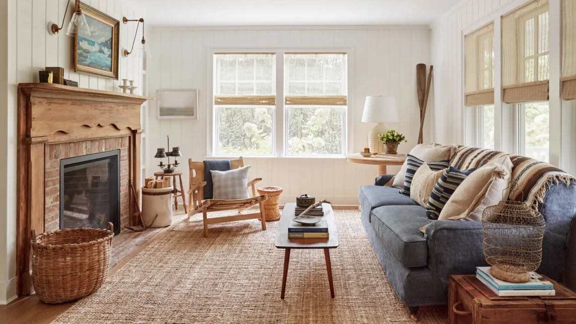
6. Coastal Blues and Whites
Crisp white walls with various shades of blue—from powder to navy—evoke seaside tranquility. Incorporate natural textures like jute, rattan, and driftwood to enhance the coastal vibe without veering into overly thematic territory.
7. Sage Green and Cream
Soft sage green paired with creamy whites creates a serene, nature-inspired sanctuary. This palette works beautifully in rooms with views of gardens or greenery, extending the outdoor feeling inside.
8. Dusty Blue, Gray, and White
A sophisticated combination that feels both contemporary and calming, dusty blue serves as an excellent wall color. Layer in various grays through furniture and rugs, with white trim keeping everything fresh and bright.
9. Aqua, Sand, and Driftwood Gray
Perfect for creating a relaxed, vacation-home atmosphere, this palette combines soft aqua accents with sandy neutrals and weathered gray tones. It’s particularly effective in rooms with plenty of natural light.
10. Powder Blue, Butter Cream, and Taupe
This softer take on blue incorporates warmer undertones through butter cream and taupe, preventing the space from feeling too cool. It’s ideal for north-facing rooms that need warmth alongside calming colors.
Warm and Inviting Palettes
11. Terracotta, Cream, and Olive
Earth-toned and increasingly popular, this palette brings warmth through terracotta (either as an accent wall or in textiles), balanced by cream backgrounds and olive green accents. It creates a grounded, organic feeling.
12. Warm Gray, Rust, and Ivory
Warm gray walls provide a neutral backdrop for rust-colored accents and ivory upholstery. This combination feels both contemporary and cozy, perfect for spaces where you want comfort without sacrificing style.
13. Caramel, Cream, and Forest Green
Rich caramel tones in leather or wood furniture pair beautifully with cream walls and forest green accents. This palette works particularly well in traditional or transitional spaces with classic architectural details.
14. Peach, Gray, and Gold
Soft peach adds unexpected warmth without being overly sweet when paired with sophisticated gray tones. Gold metallic accents elevate the combination into something truly special and unique.
15. Burnt Orange, Navy, and Cream
This retro-inspired palette has made a strong comeback. Burnt orange and navy create a striking contrast while cream keeps the combination from feeling too heavy or dated.
Bold and Dramatic Palettes
16. Navy, Brass, and White
Deep navy walls create drama and sophistication, especially when paired with brass fixtures and bright white trim. This palette works in both traditional and modern settings, feeling equally at home with velvet Chesterfields or clean-lined contemporary furniture.
17. Charcoal, Blush, and Gold
Moody charcoal gray walls or furniture paired with soft blush pink accents and gold metallics creates a glamorous yet livable space. The contrast between masculine charcoal and feminine blush feels balanced and contemporary.
18. Emerald Green, Pink, and Brass
Jewel-toned emerald green makes a bold statement as an accent wall or through upholstery. Soft pink and brass accessories add warmth and prevent the green from feeling too intense.
19. Deep Plum, Gray, and Silver
Rich plum creates depth and luxury without the heaviness of black. Paired with various grays and silver metallic accents, this palette feels sophisticated and slightly mysterious.
20. Black, White, and Warm Wood
High-contrast black and white gains warmth and livability through the addition of natural wood tones. This palette feels modern and graphic while remaining comfortable for everyday living.
Nature-Inspired Palettes
21. Forest Green, Tan, and Cream
Bringing the outdoors in, deep forest green paired with tan leather and cream textiles creates a refined, cabin-like atmosphere perfect for cozy evenings.
22. Sky Blue, Sand, and White
Inspired by beach and sky, this airy palette uses sky blue as the primary color with sandy neutrals and bright white, creating a light, uplifting environment.
23. Moss Green, Stone Gray, and Linen
This subtle, sophisticated palette mimics the colors found in nature—moss-covered stones and natural linen. It’s perfect for creating a zen-like, peaceful living space.
24. Warm Terracotta, Ochre, and Cream
Desert-inspired hues of terracotta and ochre yellow paired with cream backgrounds evoke the warmth of Southwestern landscapes without requiring themed decor.
25. Deep Teal, Copper, and Beige
Teal brings depth while copper metallic accents add warmth. Beige backgrounds keep this nature-inspired palette feeling grounded and livable.
Modern and Contemporary Palettes
26. Concrete Gray, White, and Black
Industrial-inspired with soft edges, this palette uses concrete gray as the primary color with stark white and black accents creating clean, contemporary contrast.
27. Pale Pink, Gray, and Marble White
Millennial pink meets sophistication in this modern palette. Pale pink walls or accents with cool gray furniture and marble-white surfaces feel fresh and current.
28. Mustard, Navy, and White
Bold mustard yellow paired with deep navy creates an energetic contrast, while white keeps the combination feeling clean rather than overwhelming.
29. Sage, Terracotta, and White
This on-trend combination brings together two of the most popular contemporary colors—soft sage and warm terracotta—grounded by crisp white.
30. Slate Blue, Cognac, and Cream
Slate blue offers a sophisticated alternative to navy, pairing beautifully with rich cognac leather and cream textiles for a refined modern look.
Elegant Traditional Palettes
31. Burgundy, Gold, and Cream
Rich burgundy accents with gold metallics and cream backgrounds create classic elegance, perfect for formal living rooms with traditional architecture.
32. Hunter Green, Burgundy, and Tan
This preppy, club-like palette evokes English manor houses and works beautifully with traditional furniture, oriental rugs, and dark wood.
33. Cream, Soft Blue, and Antique Gold
Delicate and refined, this palette works well in French country or traditional settings, especially when incorporated through toile patterns and vintage-inspired accessories.
34. Sage, Lavender, and Cream
Soft and romantic, this unexpected traditional palette brings gentle color without bold statements, perfect for feminine or cottage-style spaces.
35. Camel, Ivory, and Forest Green
Rich camel tones in leather or textiles paired with ivory walls and forest green accents create warmth and traditional elegance with staying power.
Vibrant and Energetic Palettes
36. Coral, Turquoise, and White
Bright and cheerful, this palette brings vacation vibes home. The key is using white as the dominant color with coral and turquoise as accents to prevent overstimulation.
37. Sunny Yellow, Gray, and White
Sunny yellow adds instant happiness when paired with sophisticated gray tones. White keeps the combination feeling fresh rather than overwhelming.
38. Fuchsia, Navy, and Gold
Bold fuchsia accents against navy create a striking contrast, while gold metallic elements add glamour and sophistication to this daring palette.
39. Orange, Teal, and Cream
Complementary colors orange and teal create visual interest and energy. Cream backgrounds prevent this bold combination from feeling too intense for everyday living.
40. Bright Green, Pink, and White
Preppy and fun, bright green and pink work surprisingly well together when grounded by plenty of white. This palette brings personality without requiring commitment to bold wall colors.
Monochromatic and Tonal Palettes
41. Shades of Gray
Using multiple values of gray—from pale silver to charcoal—creates sophisticated depth. Add texture through different materials to prevent monotony.
42. Blue Spectrum
Incorporating navy, royal blue, sky blue, and powder blue in various proportions creates a cohesive, calming space with built-in visual interest.
43. Greens from Light to Dark
Layer sage, moss, emerald, and forest green for a lush, enveloping space that feels connected to nature.
44. Warm Neutrals Gradient
Moving from cream through beige, tan, caramel, and chocolate creates warmth and sophistication through tonal variation.
45. White on White
Various shades of white and cream create an ethereal, serene space. This palette requires careful attention to texture and material to maintain interest.
Unexpected and Unique Palettes
46. Lavender, Gray, and Cream
Soft lavender brings unexpected color while remaining soothing. Paired with gray and cream, it feels sophisticated rather than overly sweet.
47. Chocolate Brown, Turquoise, and Orange
This adventurous combination works when brown serves as the anchor, with turquoise and orange as carefully balanced accents, creating energy and warmth.
48. Charcoal, Mauve, and Cream
Moody charcoal with dusty mauve creates an unusual but beautiful combination that feels both modern and romantic.
49. Teal, Mustard, and Pink
Three bold colors that surprisingly harmonize when used with restraint. Keep one as the primary focus with the others as smaller accents.
50. Olive, Rust, and Cream
Earthy and warm, this palette channels 1970s style in a contemporary way, perfect for eclectic or boho-inspired spaces.
Bonus Palettes for Specific Needs
51. Small Space Maximizer: White, Pale Blue, and Glass
Light, reflective colors and materials make small living rooms feel more spacious while maintaining style.
52. Low-Light Solution: Warm Yellow, Cream, and Gold
Compensate for limited natural light with warm, reflective colors that add brightness.
53. Multi-Purpose Room: Gray, Navy, and White
This versatile palette works for work, relaxation, and entertainment without feeling too specific to any function.
54. Pet-Friendly Palette: Medium Gray, Tan, and Charcoal
Forgiving mid-tone colors hide pet hair and wear while still looking intentional and stylish.
55. Family-Friendly: Denim Blue, Warm Gray, and Cream
Durable color choices that don’t show every mark while maintaining a put-together appearance.
How to Choose Your Perfect Palette
Selecting from these many options requires considering several practical factors beyond aesthetic preference. Start by assessing your room’s natural light—north-facing rooms benefit from warm palettes while south-facing spaces can handle cooler tones. Consider your existing furniture and whether you’re willing to replace major pieces or need a palette that works with what you have.
Think about the mood you want to create. Do you need an energizing space for entertaining or a calm retreat for unwinding? Your living room’s primary function should guide your color choices.
Consider architectural features like fireplaces, built-in shelving, or molding. These elements can either be highlighted or minimized through your color choices. High ceilings handle dramatic dark colors better than standard-height rooms, which may feel cave-like with very deep hues.
Testing Your Chosen Palette
Before committing to a full room transformation, test your selected palette thoroughly. Purchase sample pots of paint and apply large swatches on different walls to see how the color appears in various lighting conditions throughout the day. Gather fabric swatches for upholstery and curtains, placing them together with your paint samples.
Live with these samples for at least a week, observing how they make you feel at different times. Notice whether the colors that excited you initially still feel right after repeated viewing. This testing phase prevents expensive mistakes and ensures your final palette truly works for your space and lifestyle.
Implementing Your Color Scheme Successfully
Once you’ve selected your palette, implement it strategically. Start with your largest color—typically wall paint—before selecting furniture and textiles. This approach ensures everything coordinates properly rather than trying to match paint to an existing couch.
Layer your colors gradually, beginning with permanent elements like built-in features and flooring, then moving to large furniture, and finally adding accessories and accents. This methodical approach prevents overwhelming the space and allows you to adjust as you go.
Remember that color schemes can evolve. What starts as a neutral base can gain accent colors through artwork, pillows, and accessories as your style develops or seasons change. The most successful living rooms have palettes that reflect the people who live in them rather than rigidly following trends.
Maintaining Color Balance Over Time
Even the most carefully planned color scheme requires attention as you add new items to your living room. Before purchasing new accessories or furniture, reference your original palette to ensure new additions enhance rather than clash with your established colors.
Consider creating a physical or digital swatch book with samples of your main colors, making it easy to bring when shopping. This simple tool prevents impulse purchases that don’t quite work with your palette.
Seasonal updates with easily changeable elements like throw pillows, blankets, and small accessories let you refresh your space without overhauling your entire color scheme. Summer might call for lighter, brighter accent colors while autumn invites deeper, richer tones.
Conclusion: Creating Your Perfect Living Room Palette
With over 50 proven color palettes to inspire you, creating a beautiful living room is within reach regardless of your style, budget, or space constraints. The key lies in understanding color fundamentals, considering your specific needs and preferences, and implementing your chosen palette thoughtfully.
Remember that the best color schemes make you feel good when you enter the room. Trust your instincts while applying the principles outlined here, and don’t be afraid to adjust colors that aren’t working. Your living room should reflect your personality and support your lifestyle, creating a space where memories are made and life is truly lived.
Whether you choose soothing neutrals, bold jewel tones, or unexpected combinations, committing to a cohesive color palette transforms your living room from a random collection of furniture into a designed, intentional space that feels complete and welcoming. Take your time, test thoroughly, and enjoy the process of creating a living room you’ll love for years to come.
In another related article, Living Room Design Guide: Transform Your Space into a Stylish Haven (2025)